Meta’s Privacy Center
One place to understand and control your privacy across Meta’s apps.
Three of the five topic pages: sharing, security, and data use.
My role
Design Lead
End-to-end experience & reusable patterns
Platforms
Mobile & desktop
iOS, Android, mobile web & desktop
Collaboration
Cross-functional
Engineering, Content Design, PM, Research, Data Science, Comms, Legal & Policy
Timeline
3 months
From definition to launch
THE CHALLENGE
A complex problem.
A clear way forward.
The problem
Privacy information was scattered across settings, consent flows, and policies. People left the app to find simple answers.
My contribution
I led the design of one hub that explains five core privacy concerns in plain language and links straight to the right controls.
The result
1M+ people found answers in under a minute. Support tickets dropped, trust improved, and the system scaled to new topics.
THE CHALLENGE
Simple questions.
Scattered answers.
“Who can see my posts?” should be an easy question to answer. Instead, people were leaving Meta’s apps and searching elsewhere for help.
Interviews surfaced five core concerns: security, sharing, data collection, data use, and ads. For the business, that confusion eroded trust and created regulatory pressure.
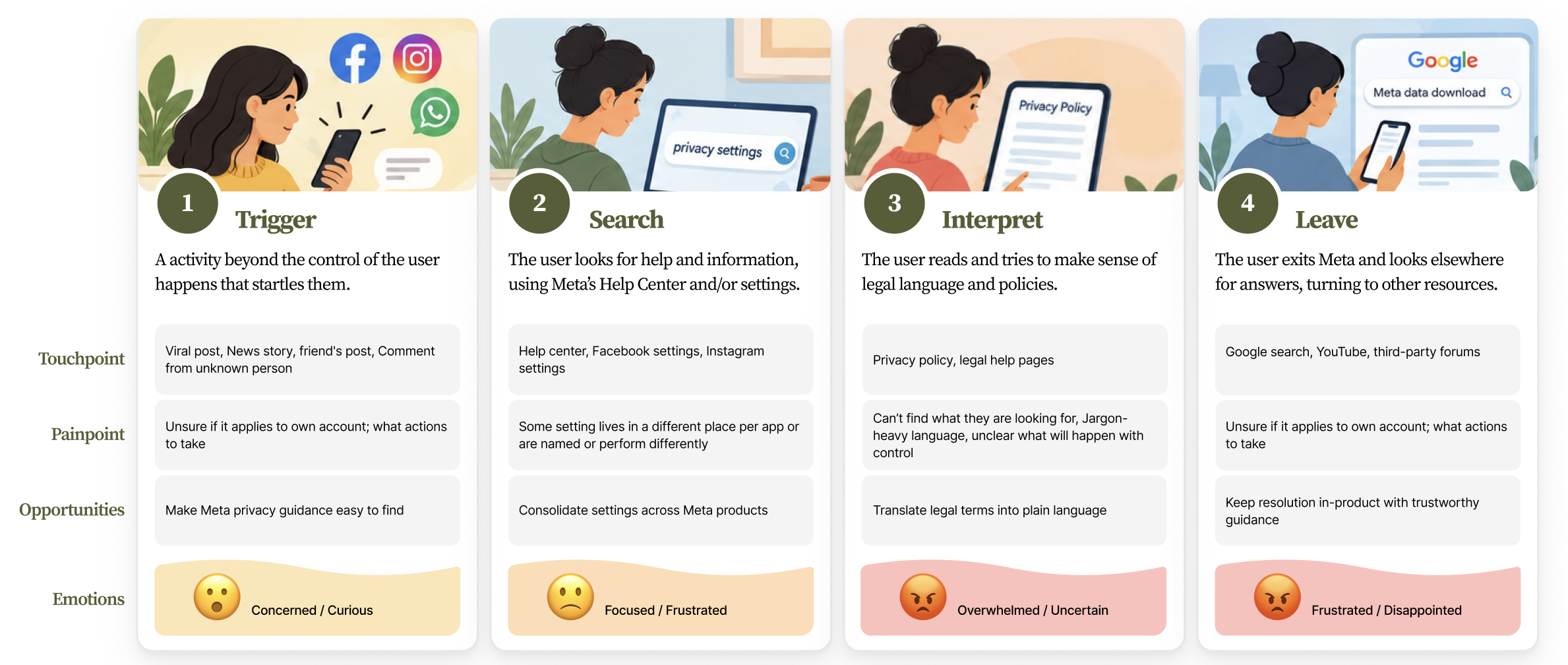
People left Meta at every stage — from the moment something startled them to searching Google for answers.
THE GOAL
Help people find an answer, know if it applies to them, and take action, building trust along the way.
THE CONSTRAINTS
Legal & policy review across 12 markets | Controls owned by different app teams | Three months. Four platforms.
Key decisions
Each topic starts with a concern people recognize, not a brand message.
Decision 01
Task first.
Not brand first
Leadership wanted to lead with Meta’s brand story. Rather than argue opinions, I tested a brand-first concept against a task-first version.
People wanted to resolve their concern and get back to their friends.
Task completion became our north star. The brand story became supporting context, not the front door.
One reusable template: context, settings (A), common questions (B), and resources (C).
Decision 02
Organize by concern.
Not by setting.
People think in questions, not settings menus. Every topic follows the same reusable pattern.
01 / Context
What you’ll learn and why it matters.
02 / Quick access
The relevant settings, one tap away.
03 / Concerns
The questions people actually ask.
04 / Resources
A path to go deeper.
From question to control in a few taps, without hunting through menus.
Decision 03
Connect to controls.
Don’t rebuild them.
One source of truth per setting. Each app team keeps ownership, and people don’t have to learn another privacy control.
The tradeoff: people leave Privacy Center to act. I added an account confirmation step so they land in the right account.
Familiar settings build trust — and make controls easier to find again.
THE FINAL EXPERIENCE
Explain.
Then act.
The complete journey: topic → concern → account confirmation → setting.
THE IMPACT
Real clarity.
Measurable change.
1M+
people found answers in under a minute
~70%
surveyed users completed their task
Fewer
support tickets after launch
Reusable
templates that scale to new subjects
REFLECTION
What I’m
taking forward.
Back-channeling works
Informal conversations before formal reviews surfaced concerns early, before they became roadblocks.
Know what you’re solving for
A clear core problem gave me the conviction to know what to act on, when to push back and what to set aside.
Never underestimate content design
One well-placed sentence can do as much work as any design pattern.