Team
Product Design: Lee Jones, Abby Mills
Content Design: Emily Shields, Misti Pinter
User Research: Denise Sauertig
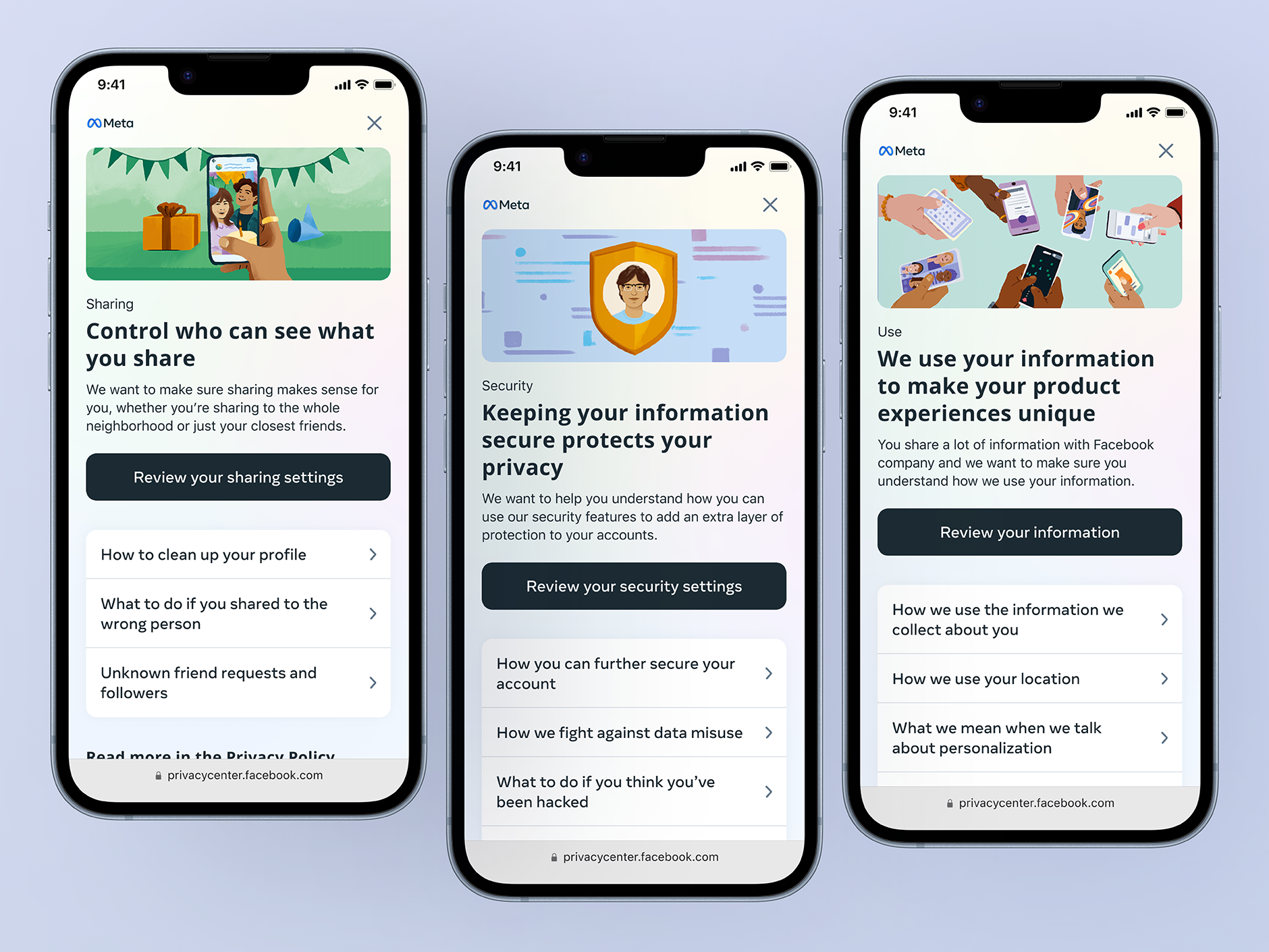
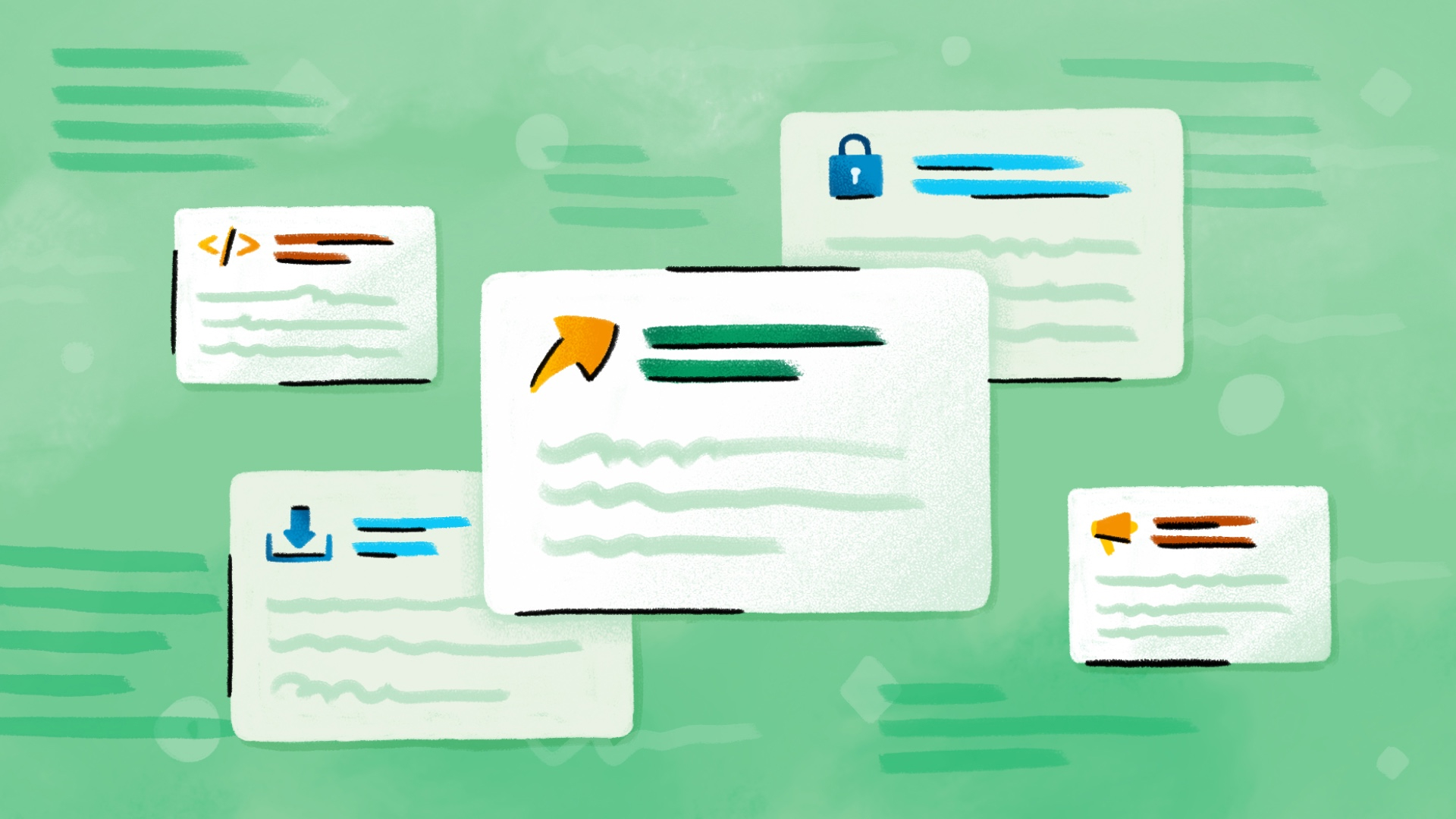
Designs for some pages in Privacy Center
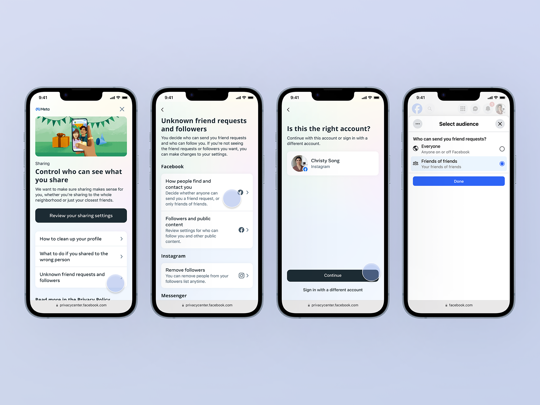
People go to Google searches and other methods outside of Meta to understand and address their privacy concerns. This can lead users to unrepeatable sites to get information about their problems. Privacy Center is a situation-based solution that allows users to learn and manage their privacy across the Meta family of apps.
Product Design: Lee Jones, Abby Mills
Content Design: Emily Shields, Misti Pinter
User Research: Denise Sauertig
Meta's privacy story was fragmented across isolated settings, consent flows, and policies, pushing people to Google and blog posts to piece together how to control their experience.
5 core privacy concerns emerged from this research:
“My account was hacked. What can I do?”
“I’m unsure who can actually see my content.”
“Is Meta listening to my conversations?”
“How is my information used by the app?”
“I’m freaked out by a creepy ad I saw, and I don’t know what to do.”
Help people quickly understand a concern, know if it applies to them, and see what to do about it, building trust in Meta's practices along the way.
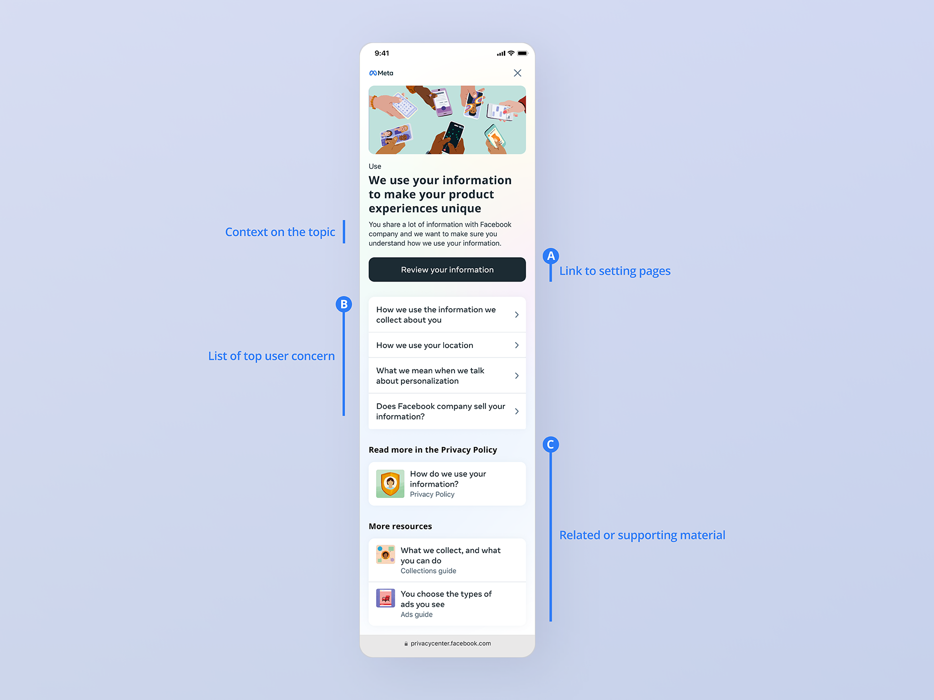
In the design, we structured the page with 3 key points:
Heuristic testing against the prior design showed measurable gains in task success. The pattern scaled beyond Privacy Center — reused for the Teens guide and other education surfaces.
Simplicity is powerful. A clear problem statement gives conviction; a well-placed sentence from a great content designer often beats a new UI pattern.