TL;DR

Meta's Download Your Information (DYI) project was designed to simplify and unify data downloads across Facebook and Instagram, ensuring scalability for other products while maintaining compliance with global privacy regulations such as GDPR and CCPA. The project focused on balancing compliance with usability, supporting multiple profiles, and accommodating diverse user needs.


Key decisions included:

  • Choosing co-location over consolidation to avoid backend disruptions
  • Creating a scalable data structure
  • Designing an intuitive selection process for users to download specific data types without being overwhelmed.
  • Developing a product homepage with clear status indicators improved navigation, addressing the challenge of long processing times.

Constraints included an evolving design system, regulatory scrutiny, and the complexity of aligning multiple platforms while maintaining a cohesive experience.


Success was measured by completion rates, ease of navigation, and user satisfaction, with the final design enhancing user control and regulatory compliance.

Making It Easier To Manage Your Information Across Meta’s Apps
Building on our efforts to simplify settings earlier this year, we’re moving a number of additional controls into Accounts Center...
www.about.fb.com/

Team

Product Design: Lee Jones

Content Design: Misti Pinter

User Research: Courtney Yang

Product Manager: Nicole Prades

Engineering Lead: Mike O'Tool

Context

Regulation landscape
Due to privacy regulations [GDPR, CCPA] around the world, companies that store your data are required to give people access to that data and they should be able to port it off platform, if desired.

Company Objective
As Meta advances its connected experiences through Account Center, the company aims to provide a seamless and secure experience for users across multiple apps by eliminating the challenges posed by fragmented settings.

Goal

The project's goal was to create a centralized platform for users to download their data from all Meta products in one place. By unifying this functionality into a single, cohesive experience, it sought to enhance transparency, improve accessibility, and give users greater control over their data. Additionally, the design needed to comply with data privacy regulations, accommodate multiple profiles and data types, and ensure a seamless experience for both linked and unlinked accounts. This centralized approach streamlined the user experience while reinforcing Meta’s commitment to user trust and responsible data management.

Non-Goal
Where the product sits within the overall central surface. This work was being done by a different team.

Scope

The scope of this project was to streamline and unify the process for downloading user data from both the Facebook App and Instagram through a consolidated experience within the Account Center, initially but could easily integrate other apps as they onboard to the central surface.

Constraints

Constraints One key challenge during the design process was the concurrent development of the design system by another team. As we worked on shaping the user experience, we had to adapt to an evolving set of guidelines and components. Without a finalized system, we made informed assumptions and iterated frequently to stay aligned with its progression. This dynamic introduced complexity, requiring our designs to be both adaptable and seamlessly integrated with the eventual system.

Additionally, the project operated under intense regulatory scrutiny. Every design decision had to meet strict compliance standards and align with legal requirements. Ensuring a user-friendly experience while maintaining full transparency, auditability, and adherence to regulatory expectations added another layer of complexity. Balancing innovation with these demands required meticulous planning and close collaboration with compliance teams.

Core Audience

The product serves a diverse user base with unique needs, preferences, and use cases, adding complexity to design and development. While most users want all their data, some prioritize speed, simplicity, or advanced customization. It must also accommodate varying technical skills, accessibility needs, and cultural differences. Balancing these factors requires thoughtful prioritization, a flexible architecture, and ongoing user research to ensure an intuitive and inclusive experience. Failure to do so could impact adoption and user satisfaction.

Joachim's Profile

Joachim

Mid 50s, Germany

Use Case: Wants to deactivate Facebook but keep his memories.

Products Used:

  • Facebook
    • Profile Icon Personal Profile
  • Whatapps
    • Profile Icon Personal Profile
Annisa's Profile

Annisa

Early 20s, Indonesia

Use Case: Wants to see what information Facebook and Instagram has stored on her

Products Used:

  • Instargram
    • Profile Icon Personal Profile
    • Profile Icon Business Profile
  • Facebook
    • Profile Icon Personal Profile

Key Stakeholders

We had three primary stakeholders involved in the project: Regulators, internal partner teams, and our Org’s leadership.

  • Regulators required strict adherence to compliance standards, ensuring the design met all legal and policy obligations.

  • Internal partner teams needed alignment across systems and processes to ensure seamless integration and consistency within the broader ecosystem.

  • Our leadership, meanwhile, sought a solution that balanced innovation and efficiency while maintaining strategic alignment with organizational goals. Managing the differing priorities and expectations of these stakeholders required careful communication and collaboration throughout the design process.

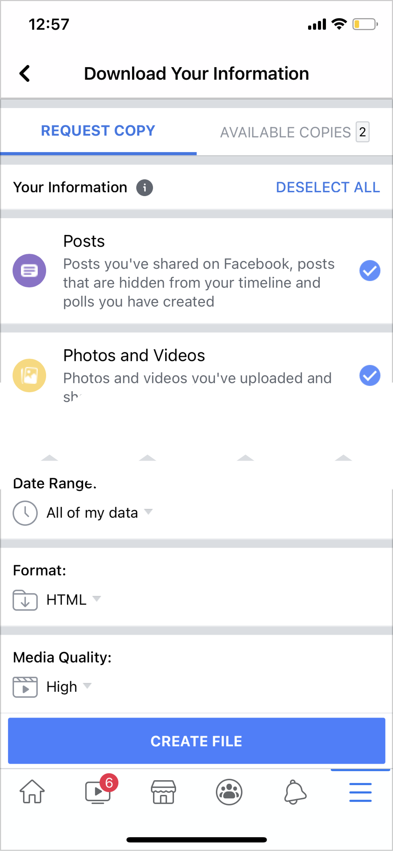
Facebook

Option 1

Allowed for the individual selection of data types and offered controls that allowed the user to manipulate the size of the file and data type depending on preferences and needs.

Pros:

  • Profile Icon Granular control over data
  • Profile Icon Can understand amount of data

Cons:

  • Profile Icon UI could seem overwhelming

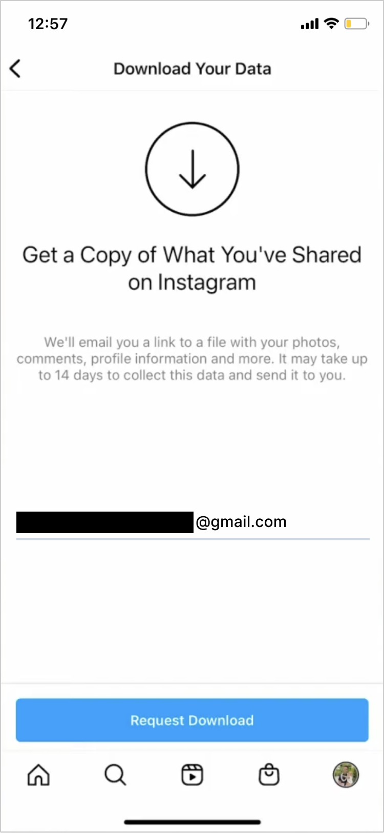
Instagram

Option 1

Presented a one click solution that was quick and easy.

Pros:

  • Profile Icon Simple interface

Cons:

  • Profile Icon Doesn’t support some use cases
  • Profile Icon No control over size of file

My Role

As the lead designer on the project, my role was to create a cohesive, user-centered experience that addressed the diverse needs and use cases of our audience. Additionally I, facilitate design thinking exercises and collaboration with developers & stakeholders, along with other responsibilities. I collaborated closely with cross-functional teams, including engineering, product management, legal, policy and user research, to understand the core challenges and translate them into intuitive, scalable design solutions. This involved developing wireframes, prototypes, and high-fidelity mockups, as well as work with UXR to test and to validate ideas and gather feedback. Additionally, I worked to ensure that the design aligned with the overall product vision, balanced user needs with technical feasibility, and maintained consistency across the platform. My contributions were integral to delivering a solution that was not only functional but also delightful to use.

Our design workstreams

We used shaped the work by asking How might we:

  1. Provide a surface for DYI that allows a person to easily access or create a download of their data across the family of apps?

  2. Design a user-friendly data structure that ensures seamless navigation as they move across multiple profiles, each containing varying amounts of data types?

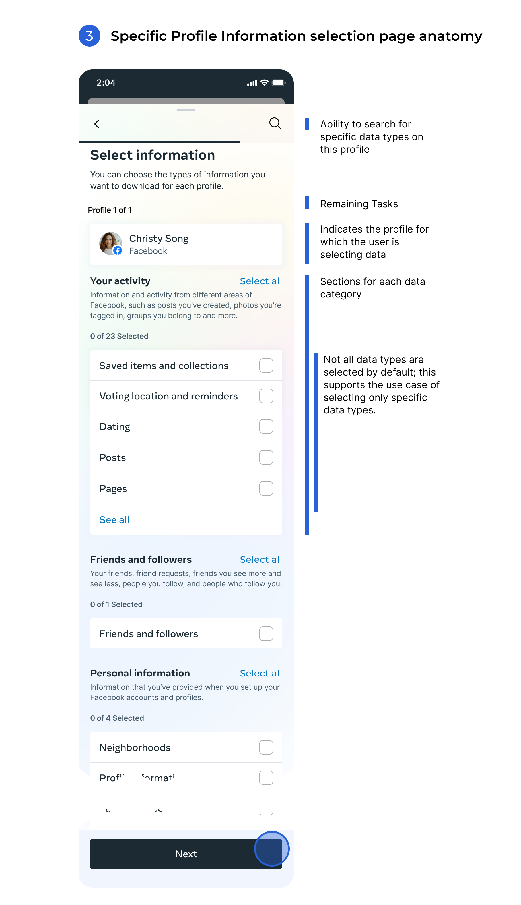
  3. Create an experience for choosing which data types a person might want to select more manageable and less overwhelming, while keeping multiple use cases in mind?

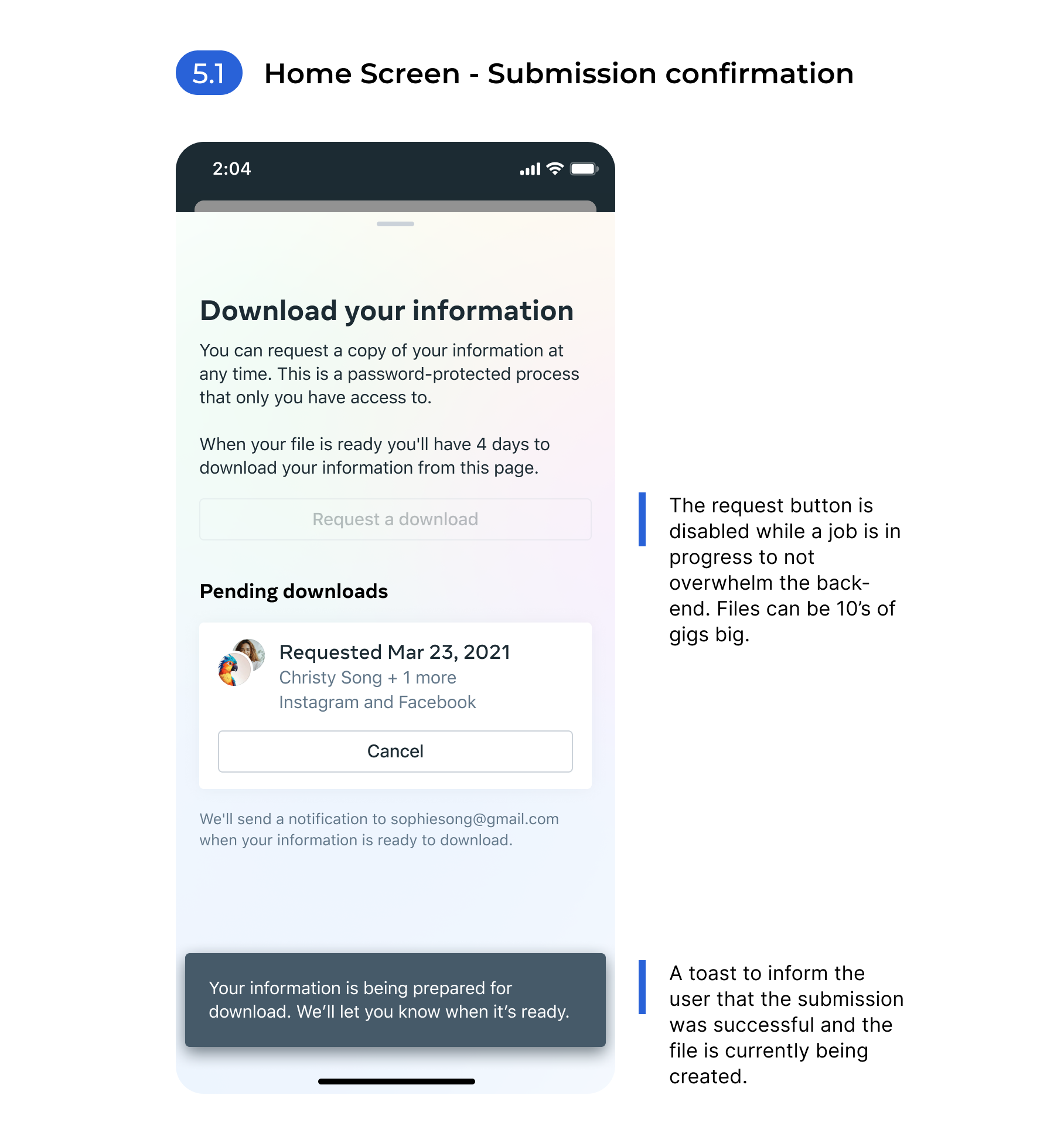
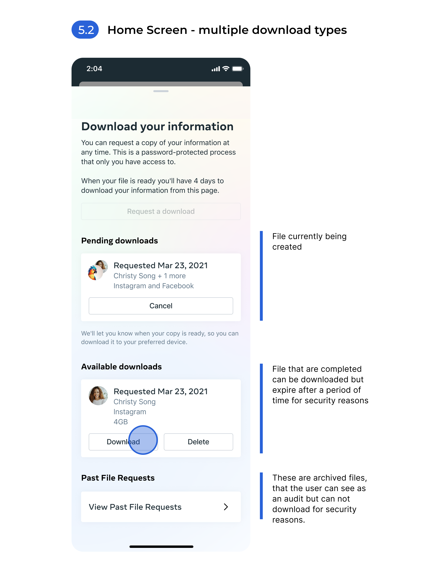
  4. streamline the process to help users efficiently navigate and differentiate between actions like requesting data and retrieving completed files, despite the lengthy timeline of up to 4 days?

First Decision:

How might we: Provide a surface for DYI that allows a person to easily access or create a download of their data across the family of apps?

Colocate vs. consolidation

Our initial decision centered around determining whether to create a collation model or a consolidation model. This choice was pivotal as it set the foundation for how we would approach data integration and analysis.


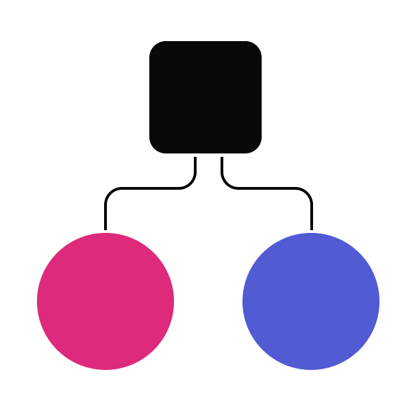
Co-locate

Option 1

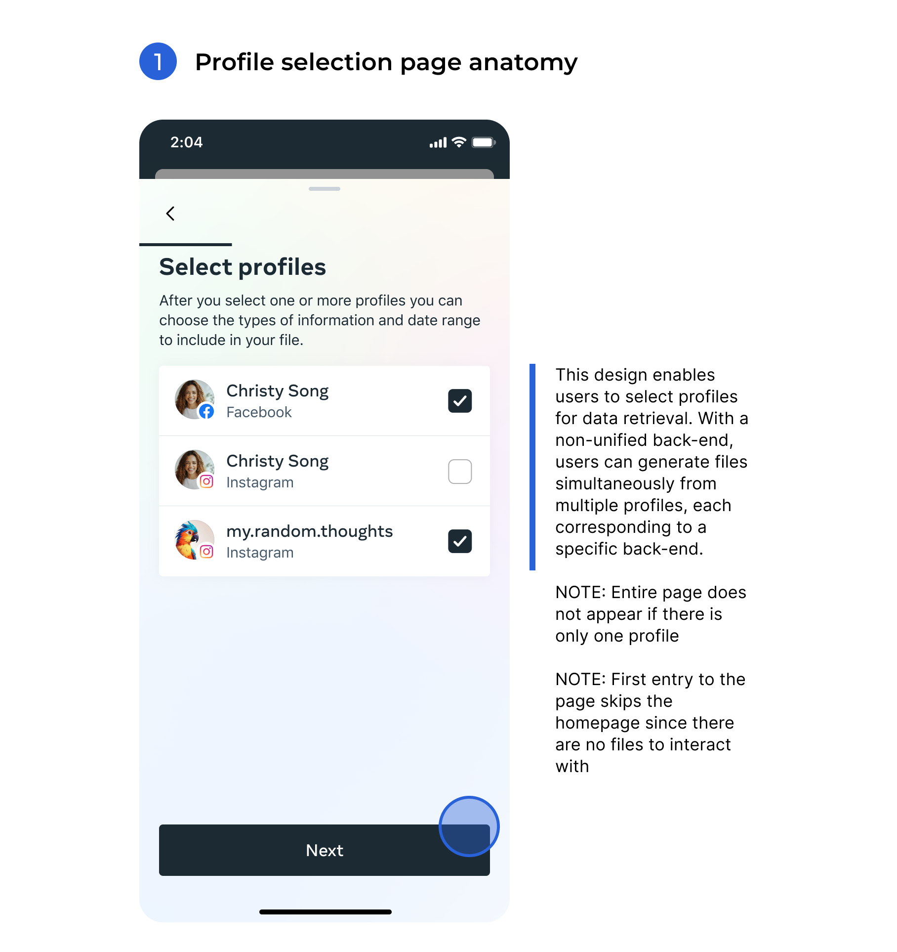
A common access point for profiles to retrieve data but data remains separate.

Pros:

  • Profile Icon Minimal backend work

Cons:

  • Profile Icon Requires designing for multiple profiles with varied data


Consolidation


Option 2

Combine data from multiple individual profiles into a single unit.

Pros:

  • Profile Icon Improves efficiency by unifying data structure across profiles.

Cons:

  • Profile Icon Requires extensive backend work and cross-company alignment.

Decision: We ultimately chose the option of co-location, because it met the needs of the project without causing a rewrite of our systems across the entire company. Also, in research we learned that users think of their data on a profile level.


Second Decision:

How might we: Design a user-friendly data structure that ensures seamless navigation as they move across multiple profiles, each containing varying amounts of data types?

Structure the data

The next workstream was to understand how to create a data structure that would scale across the Family of apps. First, we conducted an audit of the existing data structures. What we learned were some had data categories with data types nested under and some apps were just a listing of data types.


Decision: We conducted grouping exercises and tested with users to find a structure that works with the existing data types, was scalable and was understood by users.


Third Decision:

How might we: Create an experience for choosing which data types a person might want to select more manageable and less overwhelming, while keeping multiple use cases in mind?

Early exploration


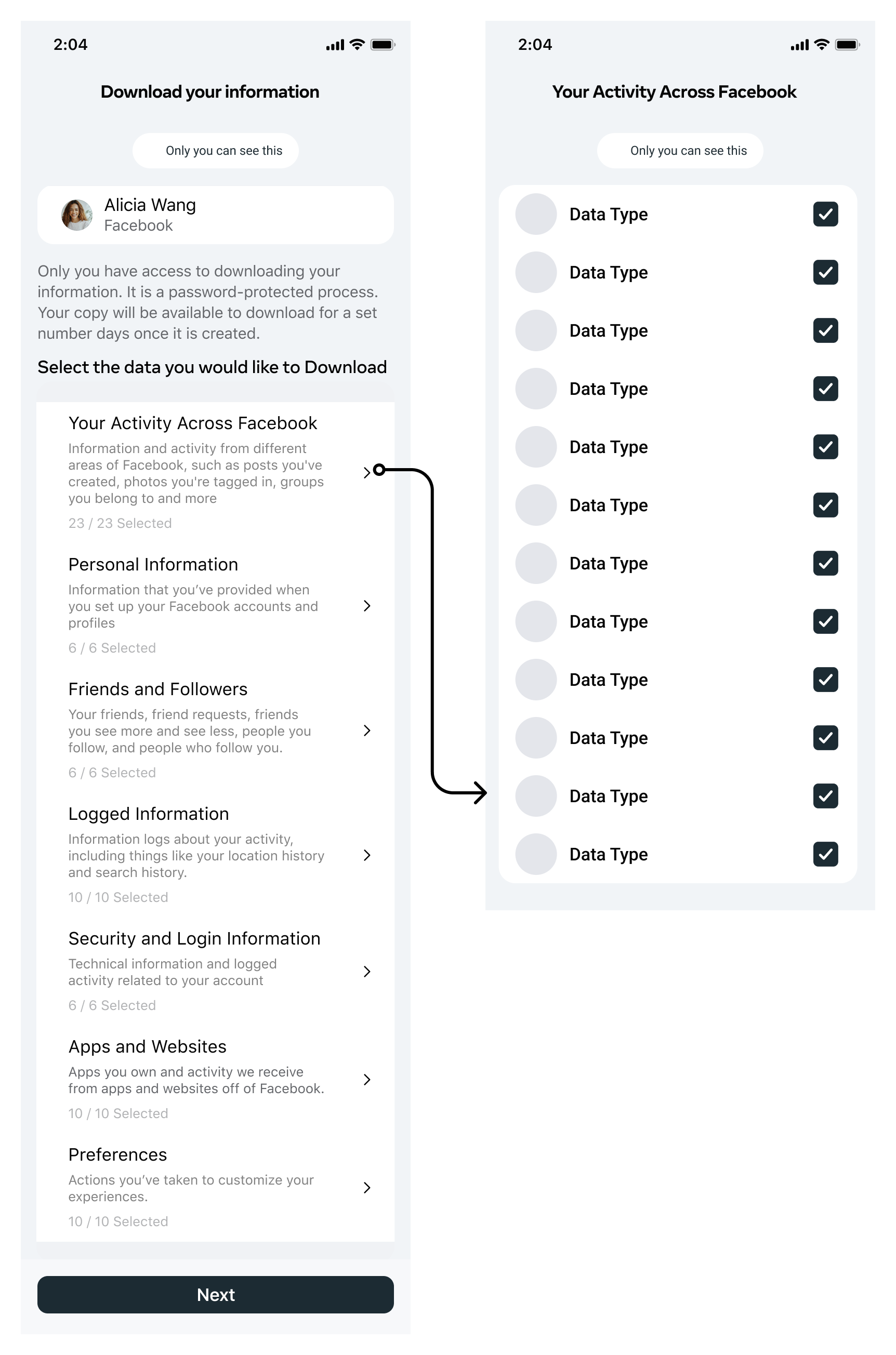
Hypothesis: Majority of users entering DYI want to download all of their data.


The idea here is that a person would see the high level data categories and by default all options would be selected. They would need to dive into each category they didn’t want to download and manually deselect those items.


Reason we did not go this direction: While most users do chose to take all their data. This design made it challenging for those who wanted only specific data to deselect unwanted items. Additionally, some users wanted to see example data types to better understand what each category contained.


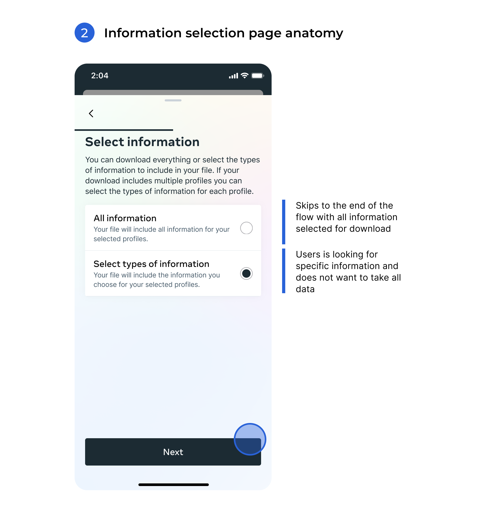
Decision: To make selecting data types more manageable and less overwhelming, we created an experience that prioritizes simplicity and clarity while accommodating multiple use cases. This involved grouping data types into logical categories, using visual aids like icons or progress bars to guide users, and providing concise descriptions or examples for each option. Additionally, implementing filtering and search functionality can help users quickly locate specific data types relevant to their needs. A step-by-step process or progressive disclosure can further simplify the experience, allowing users to focus on smaller decisions at each stage rather than being presented with an exhaustive list all at once. This approach ensures flexibility for diverse user scenarios while maintaining a streamlined and user-friendly design.


Fourth Decision:

How might we: streamline the process to help users efficiently navigate and differentiate between actions like requesting data and retrieving completed files, despite the lengthy timeline of up to 4 days?

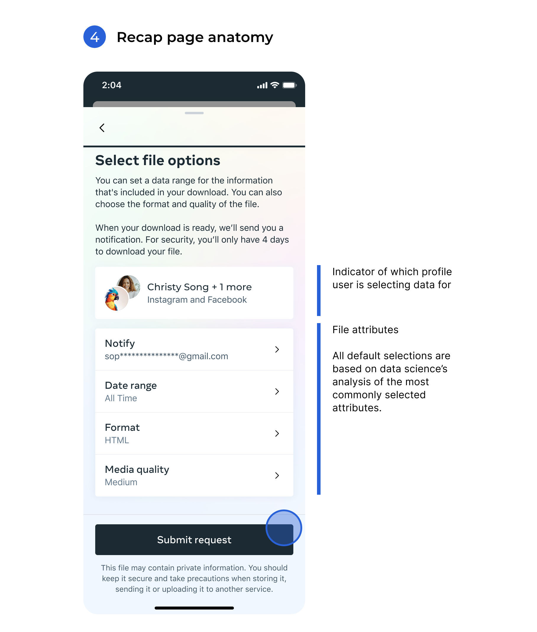
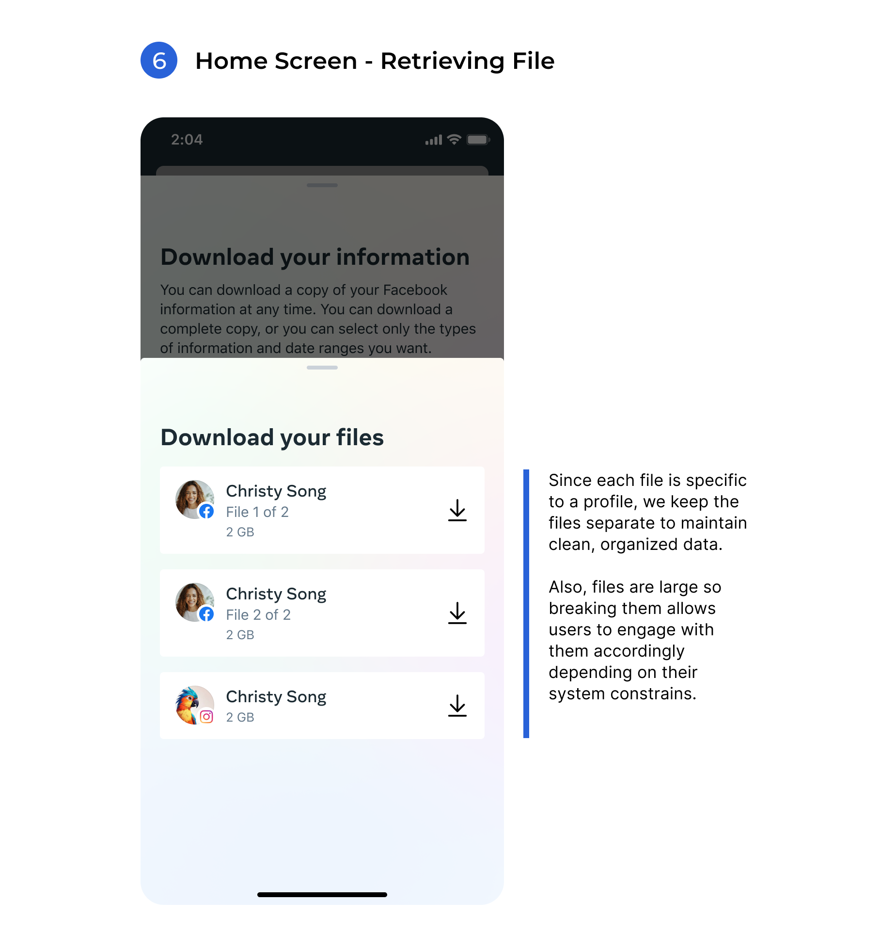
Decision: To streamline the process and help users efficiently navigate and differentiate between actions like requesting data and retrieving completed files, we implemented an interface that emphasizes transparency. A centralized dashboard would display the status of each request in real-time, using visual indicators like progress bars or timelines to communicate where each task is in the process. Separating actions into distinct sections—such as "Pending downloads" and "Ready Files"—with clear labeling and contextual prompts reduced confusion. Notifications and reminders were utilized to keep users informed about the progress of their requests. These improvements ensure a seamless experience, even with the extended timeline of up to four days.


How the final experience manifests

How we measured the success of our designs?

We measured success for the "Download Your Data" process by focusing on user experience metrics and meeting regulatory requirements. Key indicators included the completion rate of download requests, the time taken from initiation to completion, and the ease with which users could locate and retrieve their data. User feedback was gathered through surveys and usability testing to evaluate satisfaction, clarity, and overall navigation of the process. Additionally, we monitored system performance to ensure reliability and scalability, minimizing errors or delays. Success was defined by a seamless, user-friendly experience that met user expectations while maintaining high system reliability and regulator scrutiny.

Conclusion

The conclusion of the "Download Your Information" (DYI) initiative highlighted our success in meeting regulatory requirements and fulfilling our obligations with precision and transparency. By prioritizing compliance, we ensured the process adhered to all necessary standards, providing users with confidence in our commitment to their data rights. Additionally, user feedback reflected high satisfaction with the feature, emphasizing its ease of use and reliability. This dual achievement of regulatory satisfaction and user approval demonstrates the effectiveness of our approach in balancing legal compliance with an excellent user experience.

Reflection

Upon reflection, while we initially believed the profile selection screen was scalable but with incremental internal changes, it became evident over time that this approach introduced unintended complexity. As new features and functionalities were added to accommodate evolving user needs, in some cases the interface grew increasingly cluttered. This clutter for some users with many profiles made it harder to quickly locate and select their desired profiles, ultimately detracting from the overall user experience. This insight underscores the importance of proactive, user-focused design updates rather than reactive, piecemeal changes when aiming for long-term scalability.

Also working within a design system that is still being defined by another team while actively designing a product presents unique challenges. One of the primary difficulties is navigating uncertainty; without a fully established system, designers may lack clear guidelines or components, leading to inconsistent design decisions or the need for frequent revisions. This can slow down progress as teams wait for foundational elements to be finalized. This limitation led to some design choices I would go back and explore if given the chance. Components were prioritized that accommodate multiple use cases, while more specialized, bespoke components were deferred to a later stage.

Collaboration and communication also become critical. Misalignments between the product team’s immediate needs and the design system team’s priorities can result in friction or delays. For instance, if essential components or patterns are not yet defined, the product team may need to create temporary solutions that later require rework to align with the finalized system.

Balancing flexibility and adherence to evolving standards is another challenge. Designers must find ways to innovate and meet product goals without diverging too far from the system's intended direction, which requires constant coordination and adaptability. Additionally, managing stakeholder expectations becomes more complex as timelines and deliverables may shift to accommodate changes in the design system.

Despite these challenges, this dynamic can foster close collaboration and valuable feedback loops between teams, ensuring the design system evolves in ways that support real-world use cases and product needs. Clear communication, regular updates, and shared ownership of the design process are essential to overcoming these hurdles effectively.